

Case Study UI/UX Rebrand
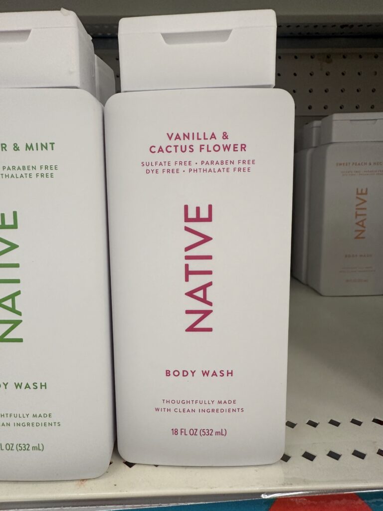
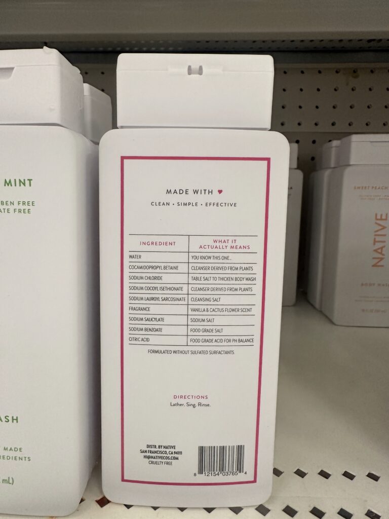
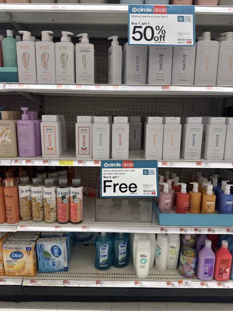
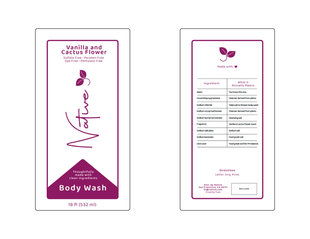
This assignment tasks us to pick a brand with low affordance to rebrand this item to give it better affordance and make the audience be able to comprehend the design of this item better instead of looking at it and having to really wonder what this item is about. For this project I picked Native’s natural ingredient hygiene products. Native is a personal hygiene care brand specifically targeting those who care for natural and minimalist ingredients. Their packaging and branding is all minimalistic much like their ingredients. They package their product all very similarly, but all too similarly that it’s almost difficult to identify which product the packaging is trying to afford. When out at the store looking at their brand on the shelf next to every other brand, it’s very easy to identify which one is their brand, but difficult to see what kind of product you’re looking at. This rebrand doesn’t change much of their brand, but does add more of a persona for character and make it easier to identify the product. Of course, much like every other rebrand, their are limitations to keep it minimal.
Journey Map
What is a journey map? It basically shows you the thought process and development of the project. How does it start?
Brainstorming
Brainstorming for this assignment was different from any other assignments I’d done before. For this assignment I needed to specially pick a brand that I see out in the store while shopping, and struggle to comprehend what it is I’m looking at. For this, I chose Native’s natural personal hygiene products. They’re known for being very minimalistic with their ingredients and their packaging. But because of this I personally always struggled with seeing what kind of product I was looking at (ie. body wash, shampoo, face wash, etc.). So I wanted to create a more prominent design choice to make it easier to see what product I’m looking at. Thus starting my sketches.
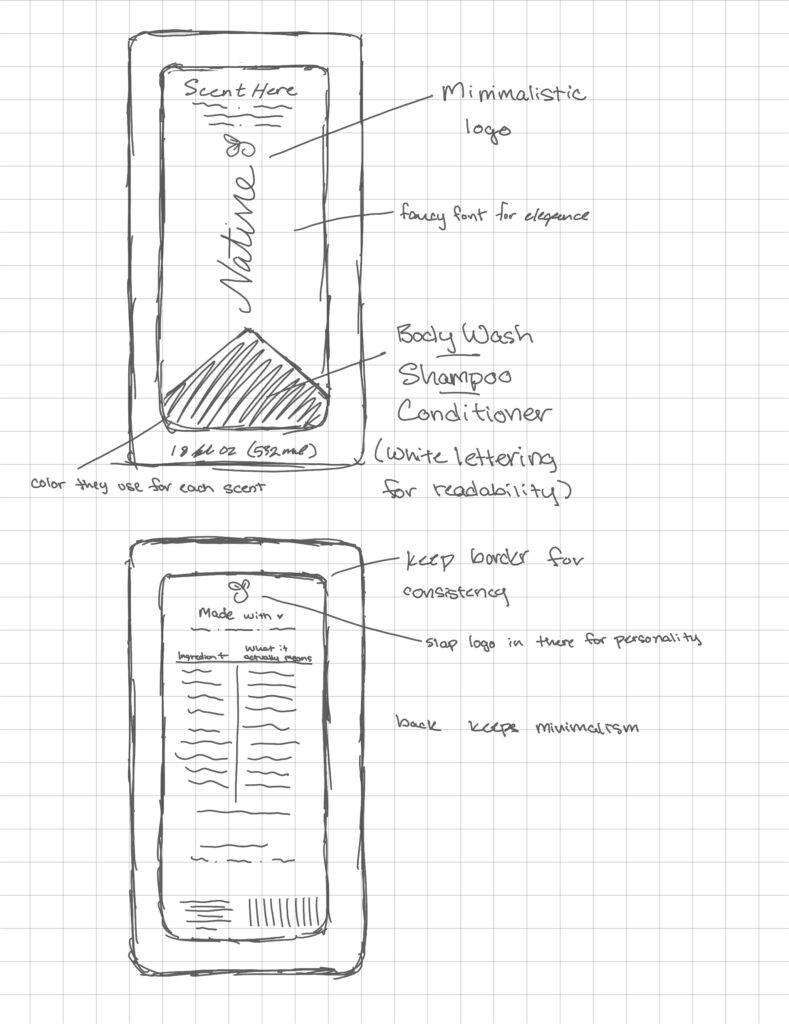
Sketching
Sketching for this assignment was just a lot of drawing out what I imagine Native would design. Minimalistic, simple, effective. I wanted to keep it clean and keep the signature colors they used for each individual scent. Clean font, clean design, everything that keeps Native being Native while giving it an easier to navigate design. So for this I wanted a prominent section to display the product name.
Development
Feedback
I, of course, need a second opinion and feedback on what can be done to make it more appealing. I take these into consideration and tie it all up with minor tweaks and fixes. Feedback is used almost after every sketching process before finalizing something.
Final Project
This is where we tie it all together and throw all of the pieces into a folder! We have our final project!